As I wrote the other day, YouTube has gone social with their new social stream. They’ve had social features before but they haven’t really had any networking features on their own platform worth mentioning.
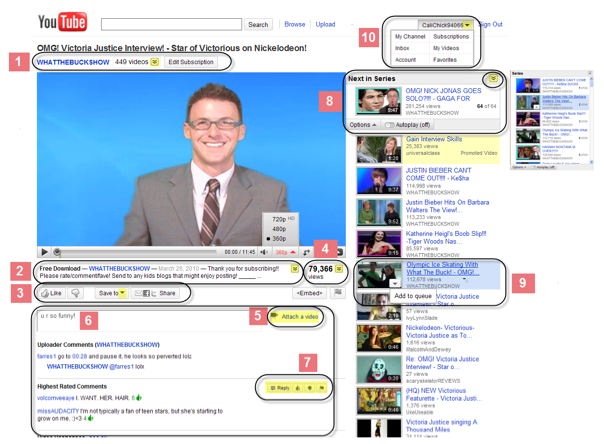
Yesterday YouTube launched their new design and here are some new features for you working with the video landing page. I start out with the overview provided by YouTube and then discuss these changes in detail.
1. New User and subscribe
At last they put the subscribe button in a prominent place making it much easier for new users to subscribe to your content when they land on your movie page.
This button is found on top of the youtube page
2. New video description – still nofollow links
The next change is the video description. They seem to have made the default visible text a bit shorter which sucks, but it is in a much better place now and it looks a bit more as though it is a part of the comment flow. This will probably give you a better chance to build conversations in your video comment fields by asking questions/making statements etc.
3. Removed star rating – Insert Like button
They have removed the star rating button and replaced it with a like button and a dislike button. I personally believe this will lead to a lot more interactions as it becomes much easier to make the choice between liking something or not liking it and the choice of setting stars for it.
They have also made it quite a lot easier to share it to facebook, twitter and through e-mail. At first I got a hard on when I saw the “Save to”-button, but… it is all about playlists. This is good, but it is also not AS good as if I could save movie to desktop. I suppose that would have been a good April fools joke. Sigh…
4. New display of the video count
The new display for the view count does two things. First it shows you how many views, just like before, but then it also expands to an honors field where you can see all the honors this movie clip has got. Honors have previously been found under insights on your stats page. They are now being made public. “Fastest growing education video in sweden”, “#5 most new subscriptions in UK” etc. These are the honors and it makes it quite easy to see who spoof their vid count and who doesn’t :D.
5 and 6. The new Comments box
The new comments box enables you to choose to make a video response, make a simple comment or interact in the way you find most suitable quite more easily than before. This is really good as video responses have lacked the possibility to attach a comment why you post that video response previously.
7. Highest rated comments
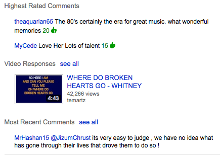
The different comments and video responses have a new order. The highest rated comments are shown on top, then there are the video responses and last you get the normal comments.
8. Next in series/next in line
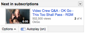
This feature is really nice as it gives you the opportunity to click “watch subscriptions” and then just kick back to view all the subscriptions in one go. It also enables you to put the next video to watch in line so that you don’t get those nasty find next in series moments. 🙂 This is awesome!! Now I can start making tutorials longer than 10 minutes without worrying if the viewer finds the next one or not.
9. Add a movie to a YouTube queue
This next feature shows you how to add one of those movies to a queue whilst watching another video.

You find it from the button that appears when you hover the movie.
10. New account options display
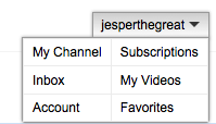
This is more of a taste move on YouTube’s behalf. They had to make available some further options in this drop down, but I am unsure whether or not I like the look of it. Another thing I dislike is that I cannot click my name anymore and get to my channel page. That sucks, but it is only a small bump in the road.
Conclusion
These changes will surely increase the interaction on the video page on YouTube. I would really love for them to make the same kind of social changes to the channel page. That would be awesome!! Great success 😀
//Jesper
Possibly related posts:
- Related posts on YouTube goes social
- YouTube Goes Social
- Adding More than One FBML box to your Facebook Page
- Related posts on YouTube new design
- Learn Card Tricks » Blog Archive » JOKER SANDWICH – Card Trick …
- New Clothes for YouTube « My Blog


I’m absolutly gutted about the description space being decreased, at least you can click on the arrow to increase it now. I wonder if they’ve changed how they index the video’s as well.
Yee… I am 100% sure this is mainly done so that they can both crawl the pages as well as index the content more easily. YouTube search has been awful for so long. Now they can actually start doing something about it whilst really using the rich snippets from the ratings and the comments.
I believe it will be great in the end although we will have to settle with a limited space in the description. It is not that they’ve taken away that many characters… but still… I agree.. that is the downside as you can write less if you want your link in the box for the easy traffic.