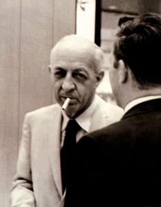
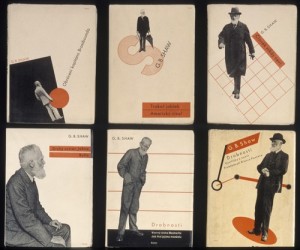
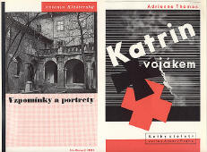
 Ladislav Sutnar is probably my favorite graphic designer of all time. Not only did he create fantastic graphic designs, but he has also inspired me to structure my otherwise chaotic thoughts in my head. As I read in one post about him he is told to have said; “Design is evaluated as a process culminating in an entity which intensifies comprehension”.
Ladislav created a diagonal motion in his graphic designs that made perfect sense when directing how a person reads a poster. Many of his techniques are not common in today’s outdoor ads, which is a shame if you ask me. There is nothing as powerful as those 1940’s graphic design posters.
Some say he was the father of modern linear/information design. I don’t know. All I know is that he has had a strong impression on my life and how I view the world. I wish I had a scanner so that I could post some of the images I took when I was in Prague a couple of years back.
What is also a fact is that he had clients such as American Airlines, General Electric Company, New York Post and many more. Putting his mark on many of the up and coming brands of his time.
I think all I want to do is to give him some homage. Now enjoy some of his work.
Possibly related posts:
- Related posts on ladislav sutnar
- How is Information Design affected by the use of Psychological …
- Late Modern


1 thought on “What Ladislav taught us about Linear Graphics”